Today I made a Valentines website thingy from a tutorial
<!DOCTYPE html>
<html lang="en">
<head>
  <meta charset="UTF-8" />
  <meta name="viewport" content="width=device-width, initial-scale=1.0"/>
  <title>Be My Valentine 💘</title>


  <link href="https://fonts.googleapis.com/css2?family=Playfair+Display:wght@500;600;700&family=Poppins:wght@300;400;500&display=swap" rel="stylesheet">


  <script src="https://cdn.jsdelivr.net/npm/canvas-confetti@1.6.0/dist/confetti.browser.min.js"></script>
This is the main HTML starter code and font and effects.
<style>
    * {
      box-sizing: border-box;
      margin: 0;
      padding: 0;
    }

    body {
      min-height: 100vh;
      display: flex;
      align-items: center;
      justify-content: center;
      background: linear-gradient(-45deg, #ff9a9e, #fad0c4, #fbc2eb, #a18cd1);
      background-size: 400% 400%;
      animation: bgMove 12s ease infinite;
      font-family: "Poppins", sans-serif;
      overflow: hidden;
This is the code for the main site and the body.
    @keyframes bgMove {
      0% { background-position: 0% 50%; }
      50% { background-position: 100% 50%; }
      100% { background-position: 0% 50%; }
    }


    .card {
      width: min(92%, 420px);
      padding: 40px 30px 45px;
      background: rgba(255, 255, 255, 0.75);
      backdrop-filter: blur(18px);
      border-radius: 28px;
      text-align: center;
      box-shadow:
        0 30px 80px rgba(0,0,0,0.25),
        inset 0 0 0 1px rgba(255,255,255,0.4);
      position: relative;
      animation: cardIn 1.1s ease;
    }
This is the code for moving the background and the moving choice.
    @keyframes cardIn {
      from { opacity: 0; transform: translateY(30px) scale(0.95); }
      to { opacity: 1; transform: translateY(0) scale(1); }
    }


    .card::before {
      content: "";
      position: absolute;
      inset: -2px;
      border-radius: 30px;
      background: linear-gradient(120deg, #ff4d6d, #ff9a9e, #fbc2eb);
      z-index: -1;
      filter: blur(20px);
      opacity: 0.7;
    }
This is the code for actually moving the choice and choosing its color and such.
    .emoji {
      font-size: 68px;
      margin-bottom: 12px;
      animation: heartbeat 1.8s infinite;
    }

    @keyframes heartbeat {
      0%,100% { transform: scale(1); }
      25% { transform: scale(1.08); }
      50% { transform: scale(1); }
      75% { transform: scale(1.12); }
    }
This is the code for the emoji animation and such.
    h2 {
      font-family: "Playfair Display", serif;
      font-size: 28px;
      color: #4a1c2f;
      margin-bottom: 30px;
      line-height: 1.35;
    }

    .buttons {
      position: relative;
      height: 78px;
    }

    button {
      position: absolute;
      padding: 14px 36px;
      border-radius: 40px;
      border: none;
      font-size: 16px;
      font-weight: 500;
      cursor: pointer;
      transition: all 0.25s ease;
      box-shadow: 0 10px 25px rgba(0,0,0,0.15);
    }
This is the code for the buttons.
    button:active {
      transform: scale(0.94);
    }

    #yes {
      left: 12%;
      background: linear-gradient(135deg, #ff4d6d, #ff758f);
      color: #fff;
      box-shadow: 0 15px 35px rgba(255,77,109,0.55);
    }

    #yes:hover {
      transform: translateY(-3px);
      box-shadow: 0 20px 40px rgba(255,77,109,0.7);
    }

    #no {
      left: 55%;
      background: rgba(255,255,255,0.9);
      color: #777;
    }
This is the code for the choices.
    .hint {
      margin-top: 28px;
      font-size: 13px;
      color: #6b6b6b;
      font-style: italic;
    }

    .heart {
      position: absolute;
      bottom: -20px;
      animation: floatUp linear forwards;
      pointer-events: none;
      filter: blur(0.3px);
    }

    @keyframes floatUp {
      from {
        transform: translateY(0) scale(1);
        opacity: 1;
      }
      to {
        transform: translateY(-120vh) scale(1.8);
        opacity: 0;
      }
    }
This is the code for moving the buttons.
@media (max-width: 480px) {
h2 { font-size: 23px; }
.emoji { font-size: 58px; }
button { padding: 12px 28px; font-size: 15px; }
#yes { left: 8%; }
#no { left: 55%; }
}
</style>
</head>
<body>
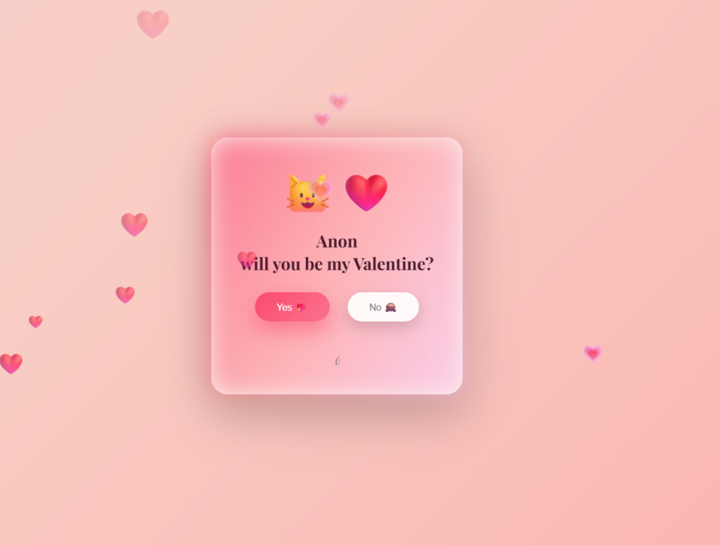
<div class="card">
<div class="emoji">🐱❤️</div>
<h2>Anon,<br>will you be my Valentine?</h2>
<div class="buttons">
<button id="yes">Yes 💖</button>
<button id="no">No 🙈</button>
</div>
<div class="hint">(:✨</div>
</div>
<audio id="hoverSound" src="https://assets.mixkit.co/sfx/preview/mixkit-cartoon-voice-laugh-343.mp3"></audio>
<audio id="yesSound" src="https://assets.mixkit.co/sfx/preview/mixkit-achievement-bell-600.mp3"></audio>
This is the code for the hint text and sounds for hovering over the buttons.
  <script>
    const noBtn = document.getElementById("no");
    const yesBtn = document.getElementById("yes");
    const card = document.querySelector(".card");
    const hoverSound = document.getElementById("hoverSound");
    const yesSound = document.getElementById("yesSound");

    noBtn.addEventListener("mouseenter", () => {
      hoverSound.currentTime = 0;
      hoverSound.play();

      const cardRect = card.getBoundingClientRect();
      const btnRect = noBtn.getBoundingClientRect();

      const maxX = cardRect.width - btnRect.width - 10;
      const maxY = cardRect.height - btnRect.height - 10;

      noBtn.style.left = Math.random() * maxX + "px";
      noBtn.style.top = Math.random() * maxY + "px";
    });

    yesBtn.addEventListener("click", () => {
      yesSound.play();

      confetti({
        particleCount: 260,
        spread: 120,
        origin: { y: 0.65 }
      });

      setTimeout(() => {
        alert("YAY 💕 I can’t wait for Valentine’s Day with you!");
      }, 500);
    });

    function createHeart() {
      const heart = document.createElement("div");
      heart.className = "heart";
      heart.innerHTML = Math.random() > 0.5 ? "❤️" : "💗";
      heart.style.left = Math.random() * 100 + "vw";
      heart.style.fontSize = Math.random() * 22 + 14 + "px";
      heart.style.animationDuration = Math.random() * 3 + 4 + "s";
      heart.style.opacity = Math.random() * 0.5 + 0.4;

      document.body.appendChild(heart);
      setTimeout(() => heart.remove(), 8000);
    }

    setInterval(createHeart, 380);
  </script>

</body>
</html>
This is the code that decides the math for the Animations.
Very nice blog! I like how you isolate the code and explain it. Next time consider using OBS for screen capture to show off the animations.